


Roman Kamushken
What is Badge?
Badge (aka Tag) — small overlapped UI item which indicates a status, notification, or event that appears in relativity with the underlying object.
{{spacer-64}}
{{setproduct-gpt}}
{{spacer-64}}
Badge Anatomy
Content
The default content of Badge's body is
- Numeric value — to display the number of events
- Text caption — to tag, name or categorize items
- Icon — to show up the status of the underlying object
- No item (dot-only Badge) — to inform without details
{{spacer-24}}
Purposes
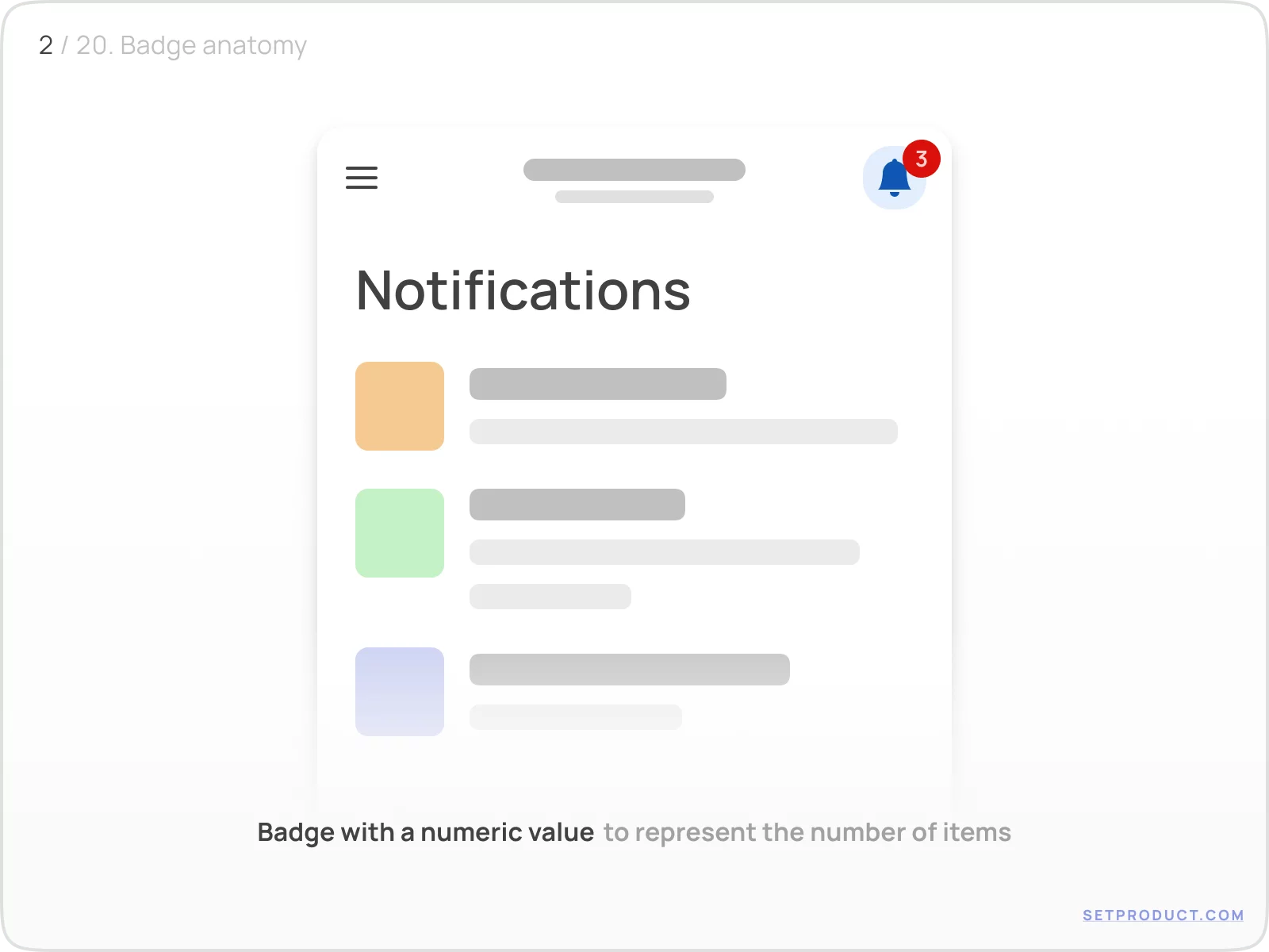
Badge with a Numeric value is used to represent the number of events related to the parent UI item:
{{spacer-16}}
Use Badges with a Text caption to specify a label for the variety of objects (e.g. to tag a topic, categorize items, or indicate views amount):
{{spacer-16}}
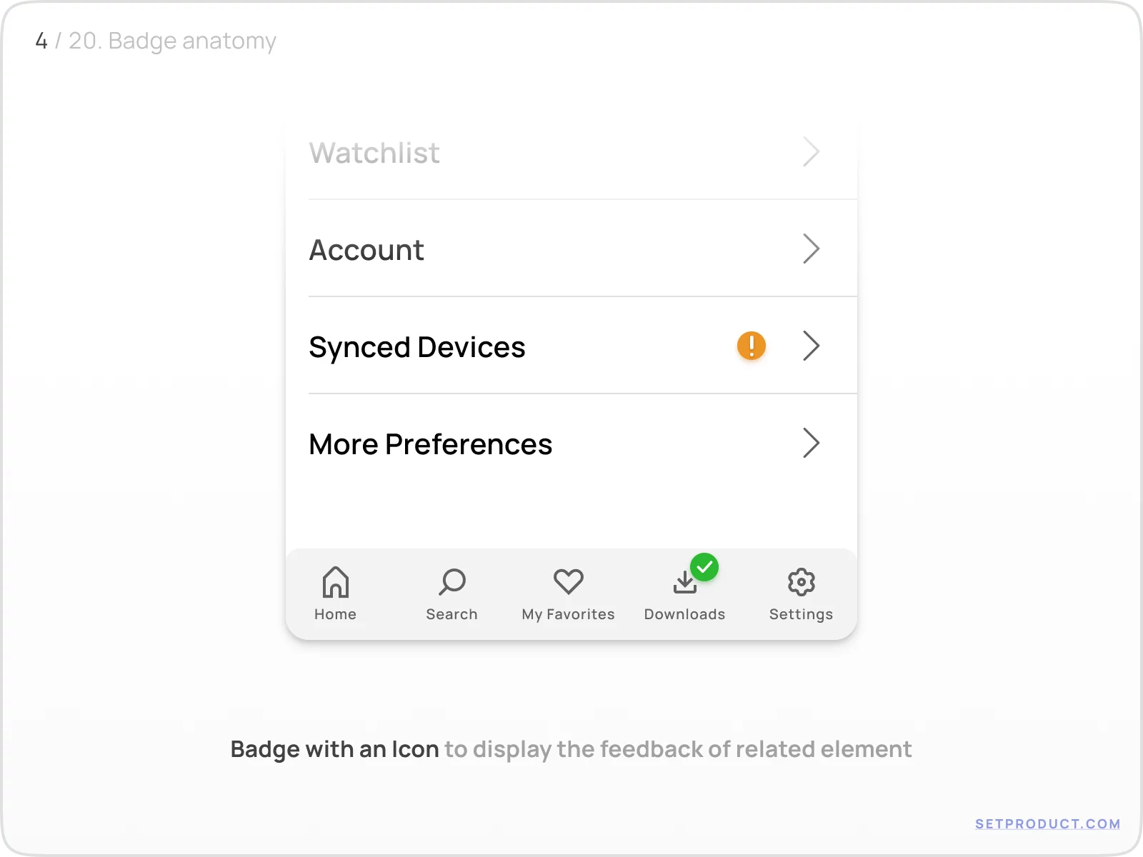
Use Icons inside Badge to show up the condition of a related component, or response to a user with the feedback.
For example, it's clear there is a kind of error with synced devices settings section and there is something downloaded successfully:
{{spacer-16}}
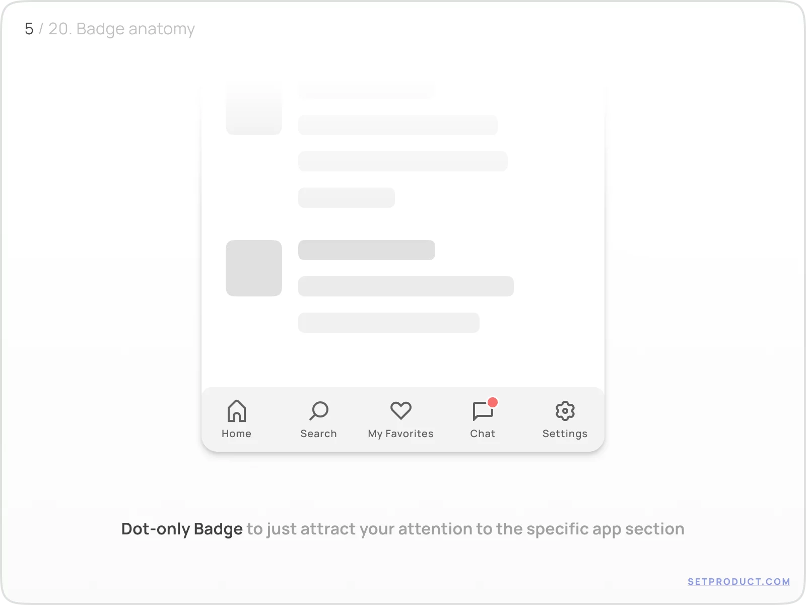
Dot-only Badge is used in order to just attract your attention to the specific control and encourage you to explore what is inside:
{{spacer-24}}
Behavior
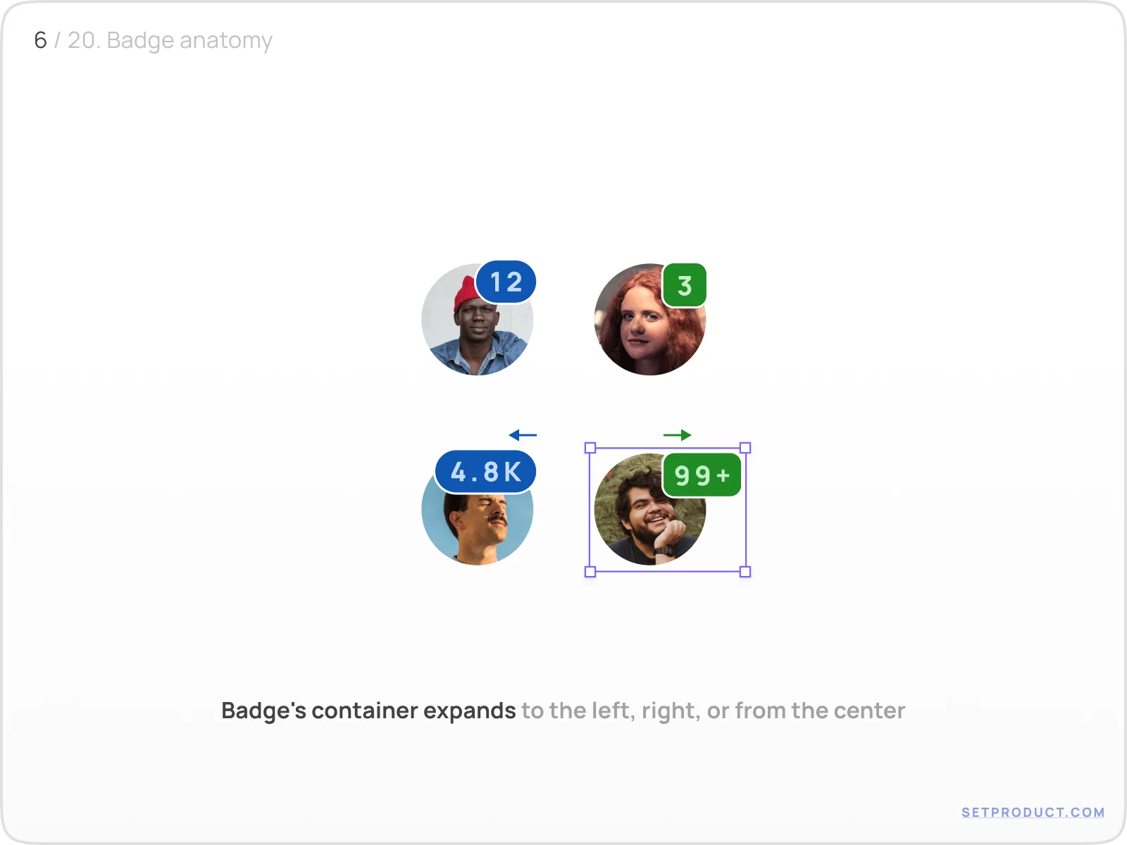
The Badge's container expands to the left, right, or from the center depending on the number of caption symbols. Use "+" or "k" abbreviations to decrease symbols amount and save space:
When Badge stretches to the right, make sure your neighbour UI elements aren't pushed aside in your layout, due to a container width is now enlarged.
{{spacer-64}}
Styles & Themes
For a deep themification in order to set Badge more distinct, you have to apply several properties:
- Colors — to regulate the Badge priority
- Corner radius — to set a Badge's container shape
- Outline stroke — to visually separate Badge from underlying item
- Shadow — to set a style with hovering effect
{{spacer-24}}
Colors
Solid Badges are more visible than shaded (where the opacity is reduced to 15–20%). Us them in priority cases, while shaded Badges may be applied for other cases, e.g. categorizing topics, tagging, etc.:
{{spacer-16}}
Choose Badge's colors wisely in order to make it more attentive or recognizable on every surface, especially when placed over images:
{{spacer-24}}
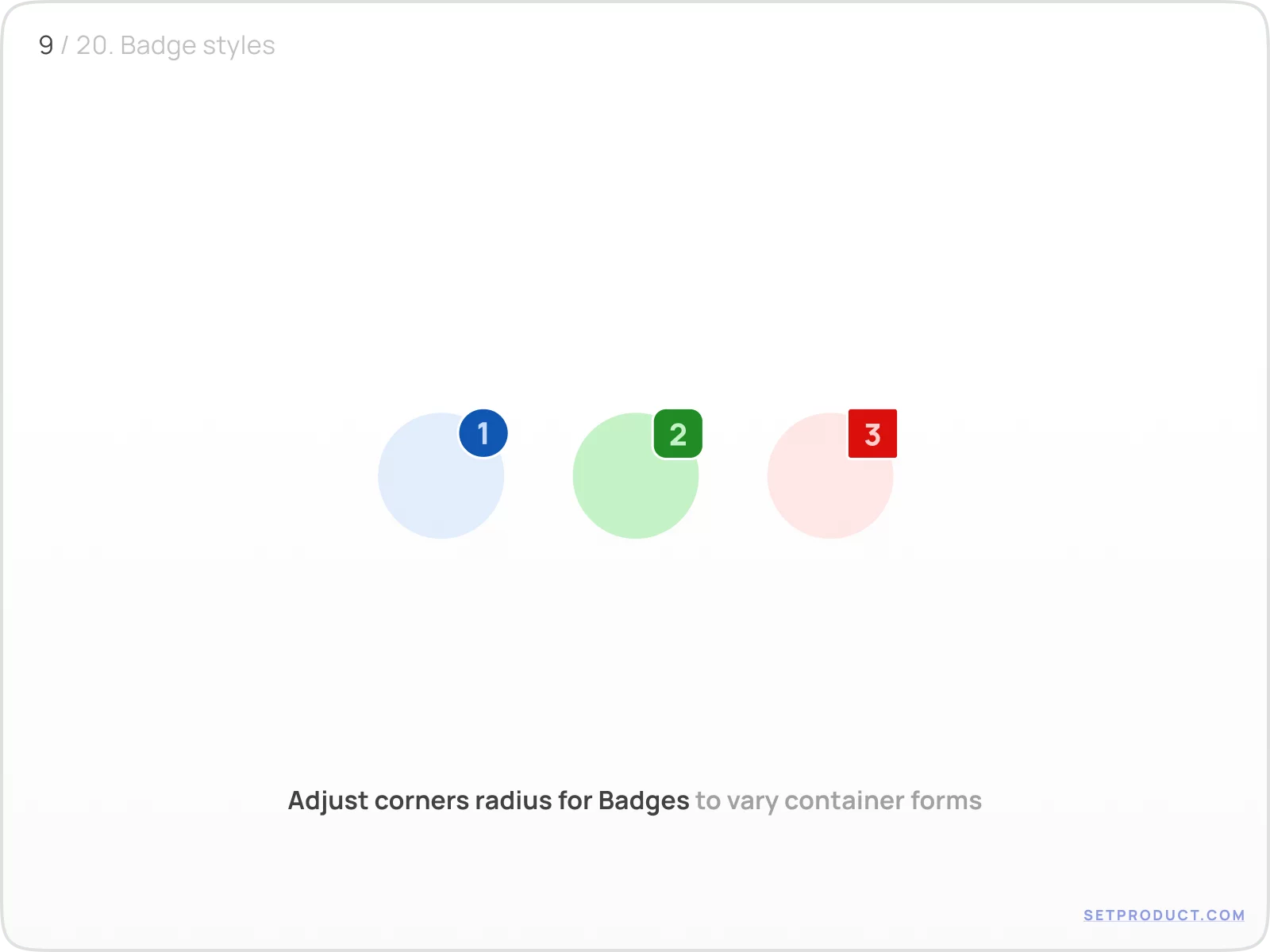
Corner radius
Adjust corners radius for Badges to vary container shapes. Rounded Badges are a popular use case, whereas enlarging to pilled when the counter is growing. You may use a square Badge in order to fit to your layout specs
(e.g. for squared UI design — IBM Carbon design system):
{{spacer-24}}
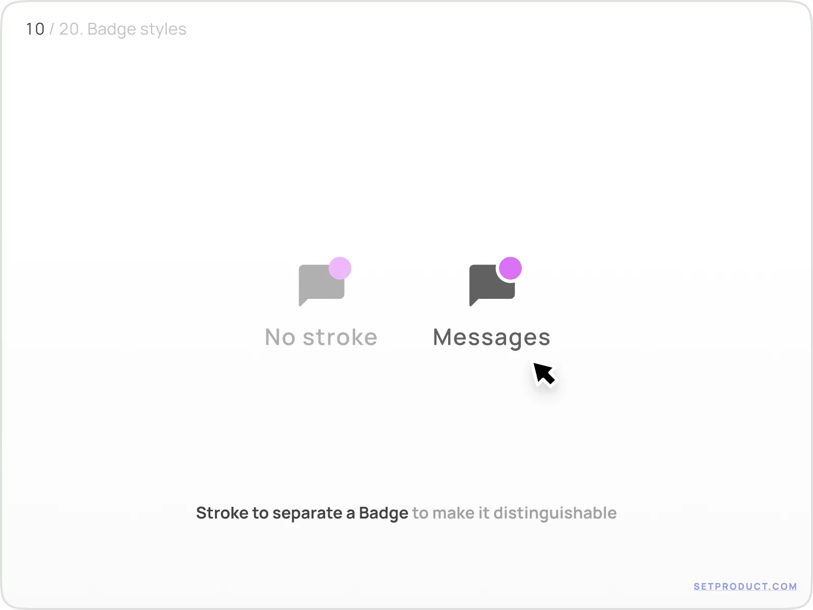
Outline stroke
This UI design small hack helps to separate a Badge and make it detached and detectable almost over every background color. Just stroke Badges with the same color as the surface:
{{spacer-24}}
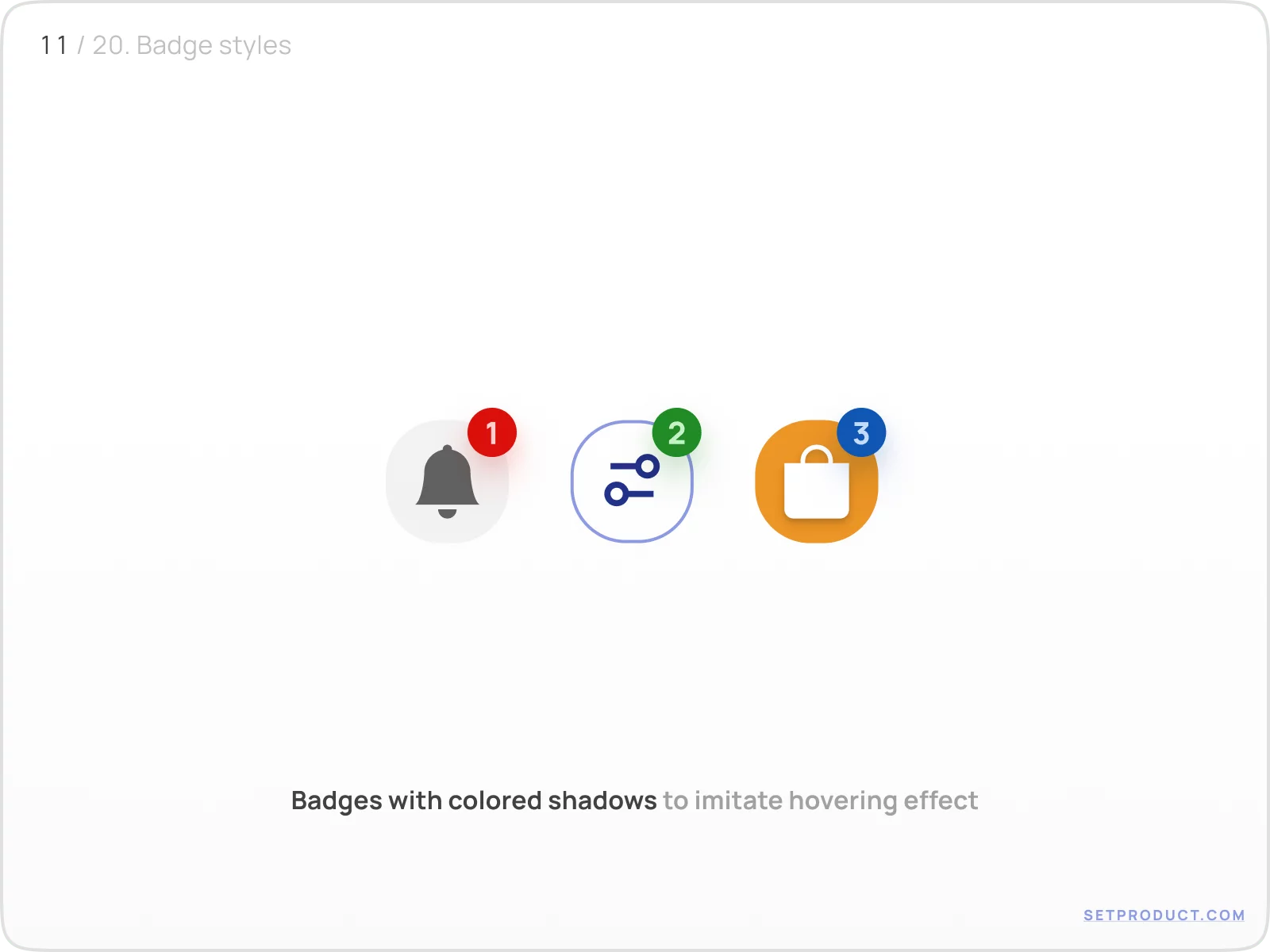
Using shadow
By setting a smooth shadow behind Badges (use the same color), you will simulate a tiny and elegant hovering effect:
{{spacer-64}}
UX & Use cases
There are several UX patterns where are Badges most commonly used:
- Messaging
- Filtering
- Ecommerce
- Social
- Marketing
- Categorizing
- Tagging
{{spacer-24}}
Messaging
In conversational patterns (Chat, Messages, Inbox) Badge used to inform about new incoming messages. Dot distinctly divides fresh emails and recent:
{{spacer-24}}
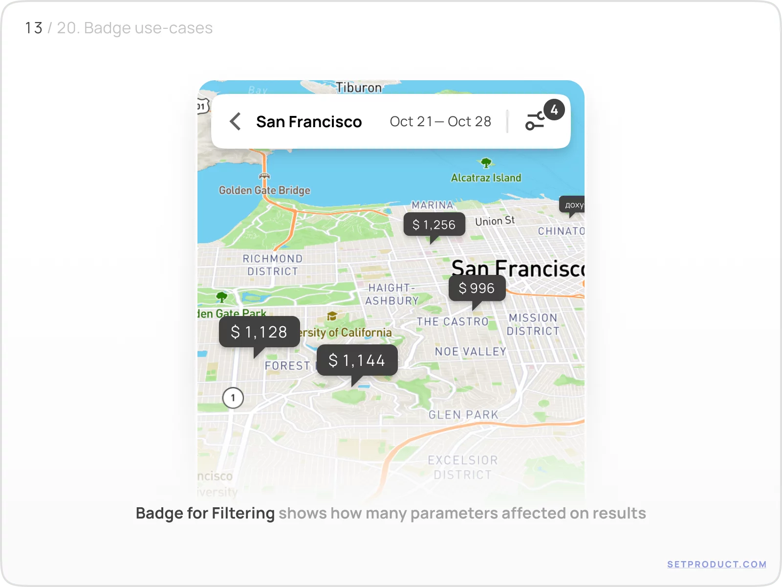
Filtering
It's user-friendly to overlap a Badge over filtering control when some options were selected before.
Below we see some tooltips on the map. It's clearly distinct — some filtering options were picked affecting on results, and Badge has now appeared at the app corner:
{{spacer-24}}
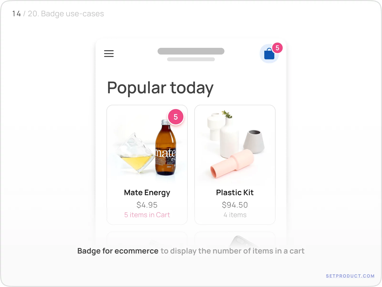
Ecommerce
In most shopping apps Badges are used to display the number of products added to a cart:
{{spacer-24}}
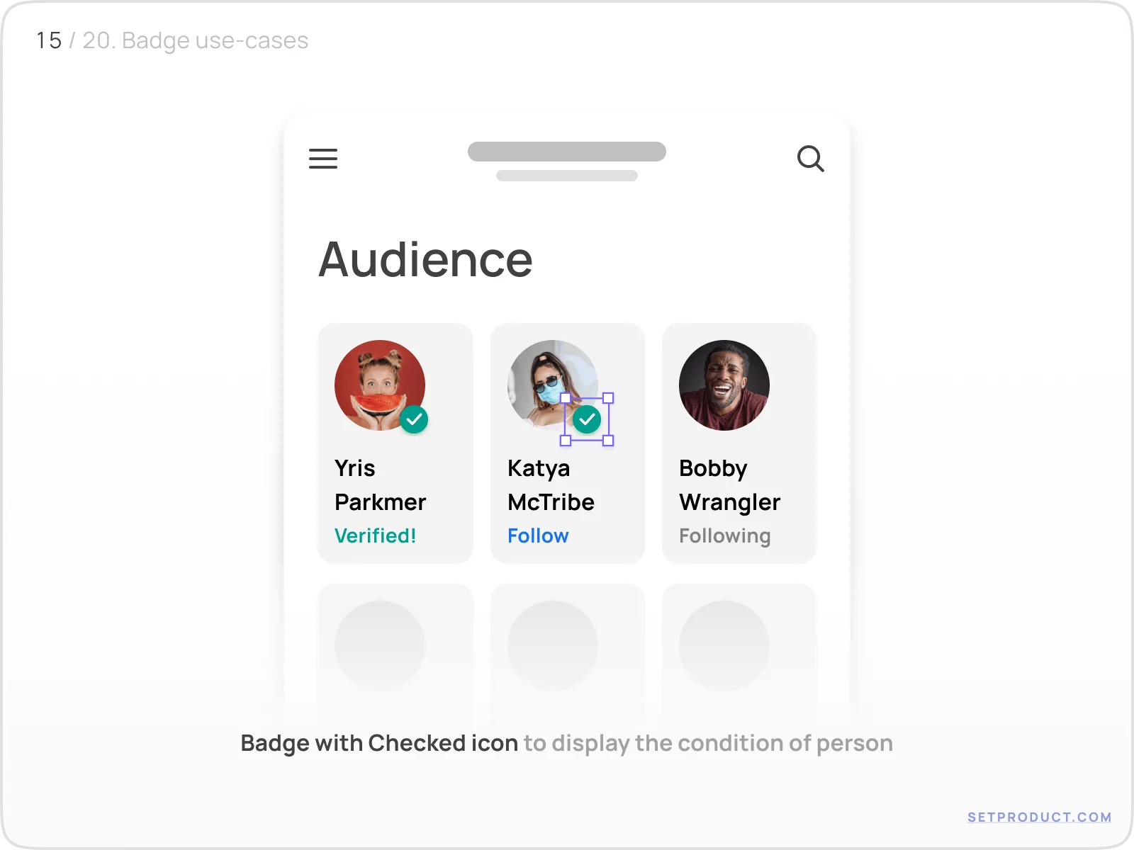
Social
Icon-only Badge represents additional properties/statements for the person:
{{spacer-16}}
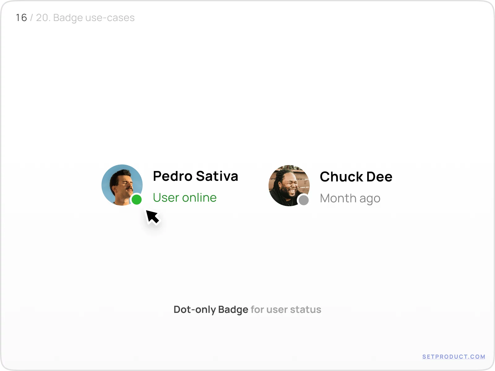
Dot-only Badge displays user's status — Is it online, or not:
{{spacer-24}}
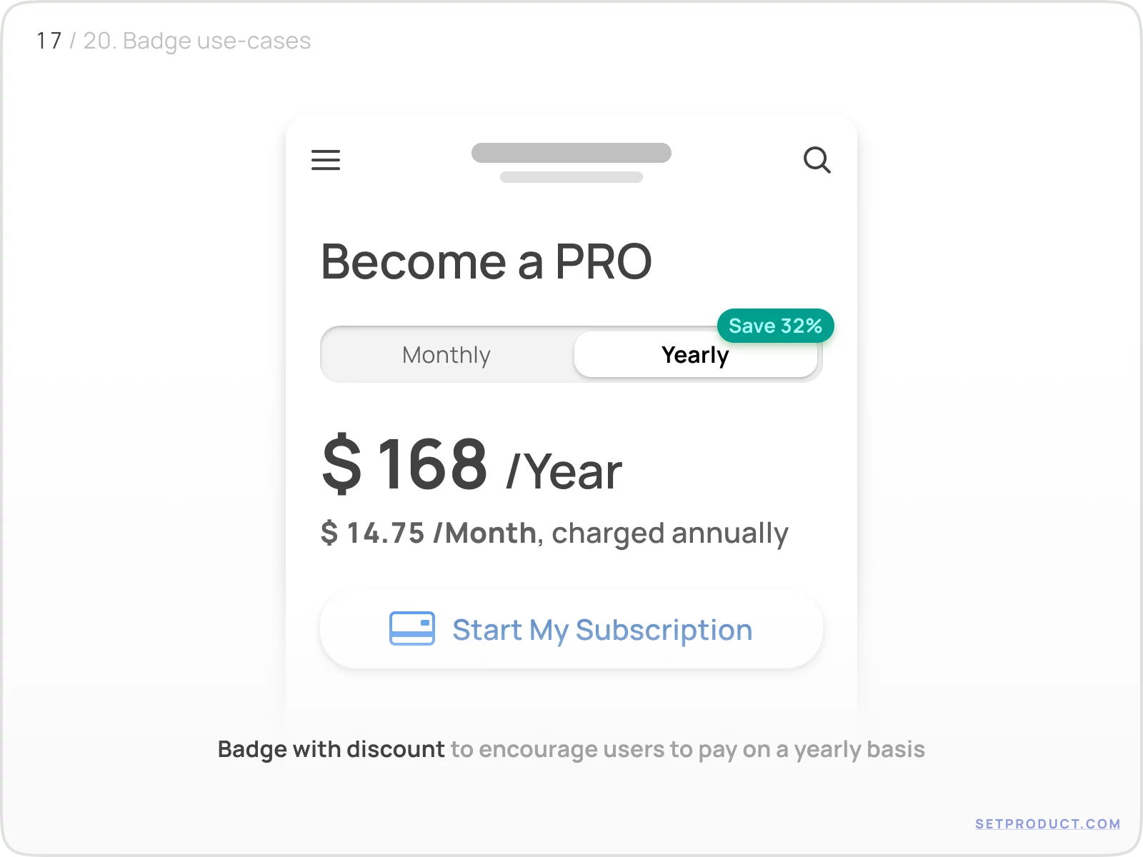
Marketing
There are cases when Badge helps to encourage users to take action or perform a choice commercially valuable.
Here is a Badge placed over segmented control to highlight the necessity to choose yearly payment:
{{spacer-24}}
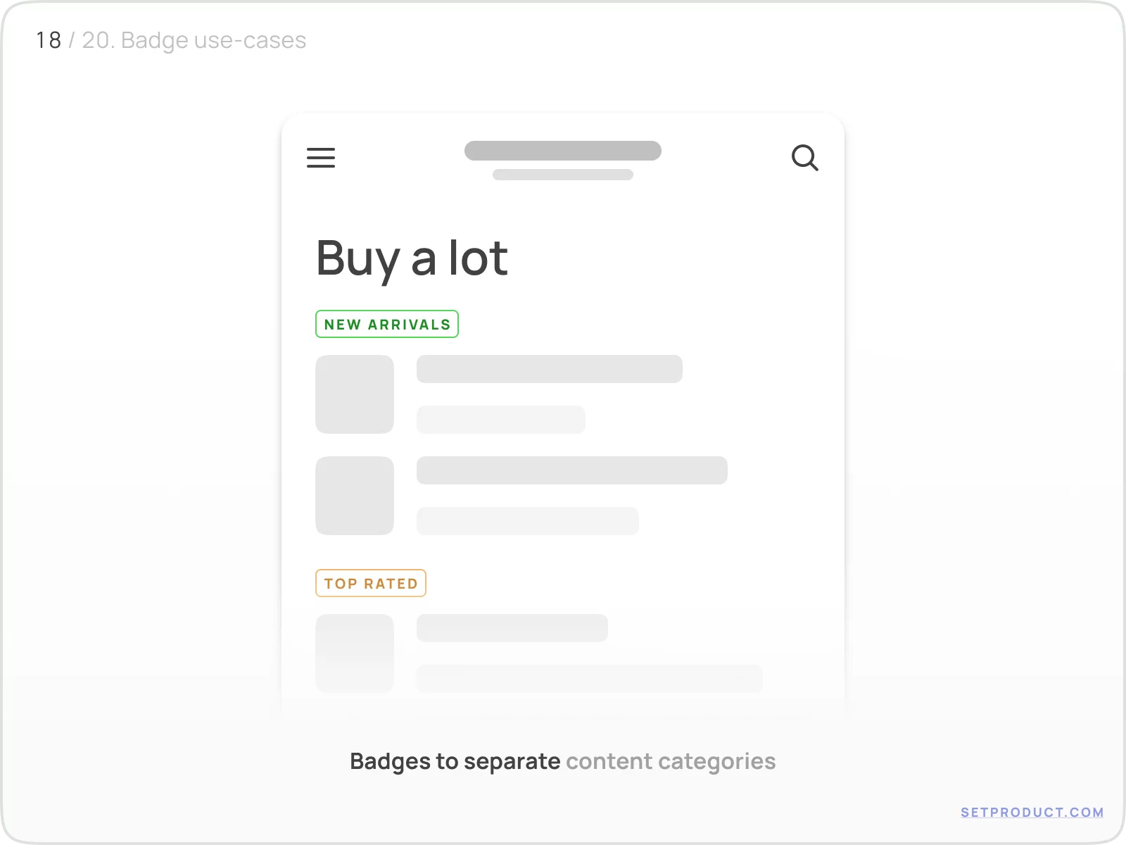
Categorizing
Separate content categories by using Badges to label and divide sections making them distinguishable by using different colors:
{{spacer-16}}
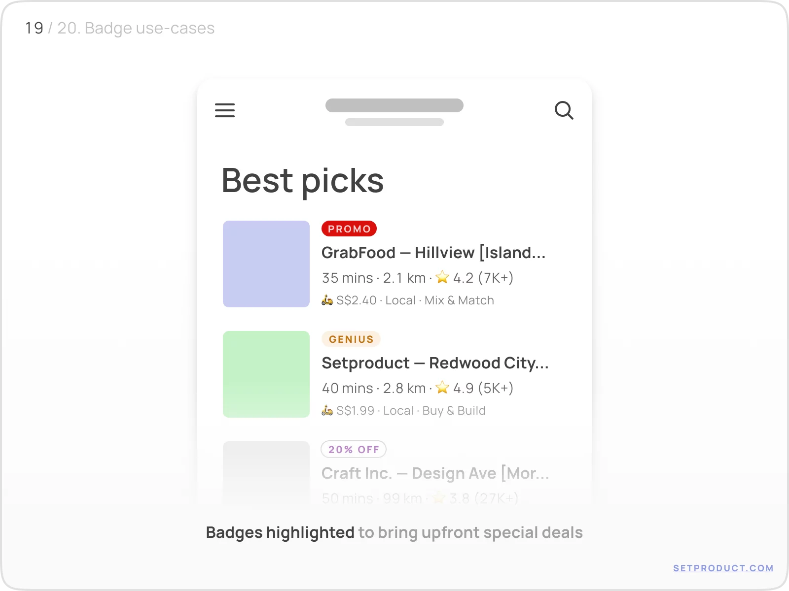
Sometimes Badges are used as tags to highlight special deals:
{{spacer-24}}
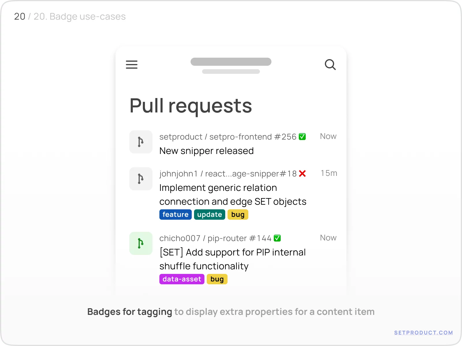
Tagging
Implement Badges to display extra properties for a content item, or to visualize the number of parameters the specific item is associated with:
{{spacer-24}}
{{stars-conclusion}}
{{spacer-24}}
This is all you need to know to design better Badges. Now it's time to visit the homepage of Setproduct, where you'll find a huge number of free and premium UI Kits and design systems.
Also, we specialize in custom design and development. We will be happy to help you with any project: Mobile & Web Apps, Websites, B2B, CRM, Delivery Systems, Online Learning Platforms, and lots more.
You can check our portfolio on many platforms: Dribbble, Twitter, Figma, Reddit, Pinterest, Linkedin. Also, make sure to check the Testimonials of our happy customers.
{{spacer-64}}
Related links
- Badges in Figma React UI kit
- Badges in Chakra-UI
- Badges in MUI
- Badges in Material You (Figma)
- Badges in Appka iOS kit (Figma)
.webp)

%20(1).webp)
.webp)
.webp)
.webp)
.webp)

.webp)
.webp)

.webp)
.webp)
.webp)
.webp)


%20(1).webp)

%20(1).webp)
.webp)
.webp)


