For those of us who learned how to drive a few decades ago, driving a modern car is a completely different experience. New cars come with rear-view cameras, obstacle sensors, parking assistance, lane-change assistance, adaptive cruise controls, autopilot driving, and even web browsers. Many of these features should make driving a safer and more comfortable activity. And they will — but only if car designers understand the most basic fact about human attention: it’s limited. And if they design these sophisticated car features so that they don’t take away cognitive resources from the basic task, which is driving.
Soft Buttons That Demand Attention
Tesla’s Model S has few physical controls — all placed on or very close to the steering wheel. Driving-related functions like cruise control, autopilot, wipers, and lights are all accessible through these controls. But most of the “secondary” features (including rear-view camera, cell phone, media player, and climate control) do not have dedicated physical controls. Instead, the main way to select them is through the 17” touchscreen display placed on the dashboard, between the driver and the passenger seats. While this is a big screen (three times the area of an iPad), it can’t show everything — so, making matters even more complicated, in Version 9 of Tesla’s operating system, some features are placed inside an expandable menu.

While touchscreen dashboards offer more flexibility than real dashboards, they have one big disadvantage: no haptic feedback. In order to reliably touch these buttons, people must look at them. Whereas with a physical button we can learn its location and acquire it without directing much, if any, attention to it (and hence we can play the piano while reading the score or we can touchtype on a real keyboard), locating a soft button requires us to visually confirm its position.
When soft buttons are hidden under menus, selecting them involves multiple touchscreen interactions, and thus even more time and attention. And, in a car, time spent with the UI is time spent ignoring the road.
Poor Target Design
Target Placement Leads to Longer Interaction Times
Fitts’s Law says that the time for the finger to reach a target depends on the size of that target and the distance to the target. Thus, controls placed farther away from the initial hand position will take longer to acquire than those placed closer.
When my generation learned to drive, the standard hand position was 2–10 (corresponding to numbers 2 and 10 on the clock). With airbags and smaller steering wheels becoming common, National Highway Traffic Safety Administration (NHTSA) has changed its recommendation and now 3–9 has become the safest position. For both these hand placements, the optimal control positioning would be on the middle left edge of the screen, close to the driver’s right hand. Yet, Model S’s controls are placed at the very bottom of the 17” screen — an area that is next worst possible (after the right edge of the screen).

Having the controls at the bottom of the screen also means more time for the eyes to move from the windshield to the menu area, and also less of a chance that people will be able to use their peripheral vision to attend to unexpected stimuli that appear on the road when they are busy interacting with (and looking at) the touchscreen.
Within a given menu, the most commonly used options should be the easiest to access. Yet, Tesla’s decisions with respect to the ordering of the controls in the menu are at best dubious. The first option is the access to all the car’s settings and customizations — something that is unlikely to be used often while driving. The rear-view camera (an essential feature in a car whose rear-windshield view is partially blocked by the backseat headrests) is available under the arrow menu, as is the cell phone. And these arguably frequently used options are not even given priority in that menu: instead of being immediately above the arrow icon (to minimize finger travel time), the Calendar, Energy, and Web (for the web browser) are listed first. (How often will you use these during driving compared to the rear-view camera and the phone?)
Target Size
The other factor in target-acquisition time is the target size: the larger the button, the faster it will be reached. Yet, with version 9, Tesla decided to make its targets smaller (presumably in order to fit more options in the visible menu bar — 7 in version 8 compared with 10 or 11 in version 9). It’s a temptation that many mobile designers have succumbed to — but unfortunately it does not lead to usable designs.

Accidental Touches
Because the targets in the control panel are too close to each other, it’s sometimes too easy to touch the wrong target. For example, on many occasions I triggered the seat warmer while trying to change the temperature or tap the climate icon. The seat icon is also easy to accidentally touch when the driver tries to access the most recent app by using a swipe up on the arrow icon (a gesture shortcut likely inspired by iOS).

Map Always on Screen
To allow people to quickly get the information that they need from the screen and then move on, text on car dashboards should be easy to read in a variety of light conditions. Text that is too small, appears on a busy background, or has low contrast with the background does not usually satisfy these requirements.
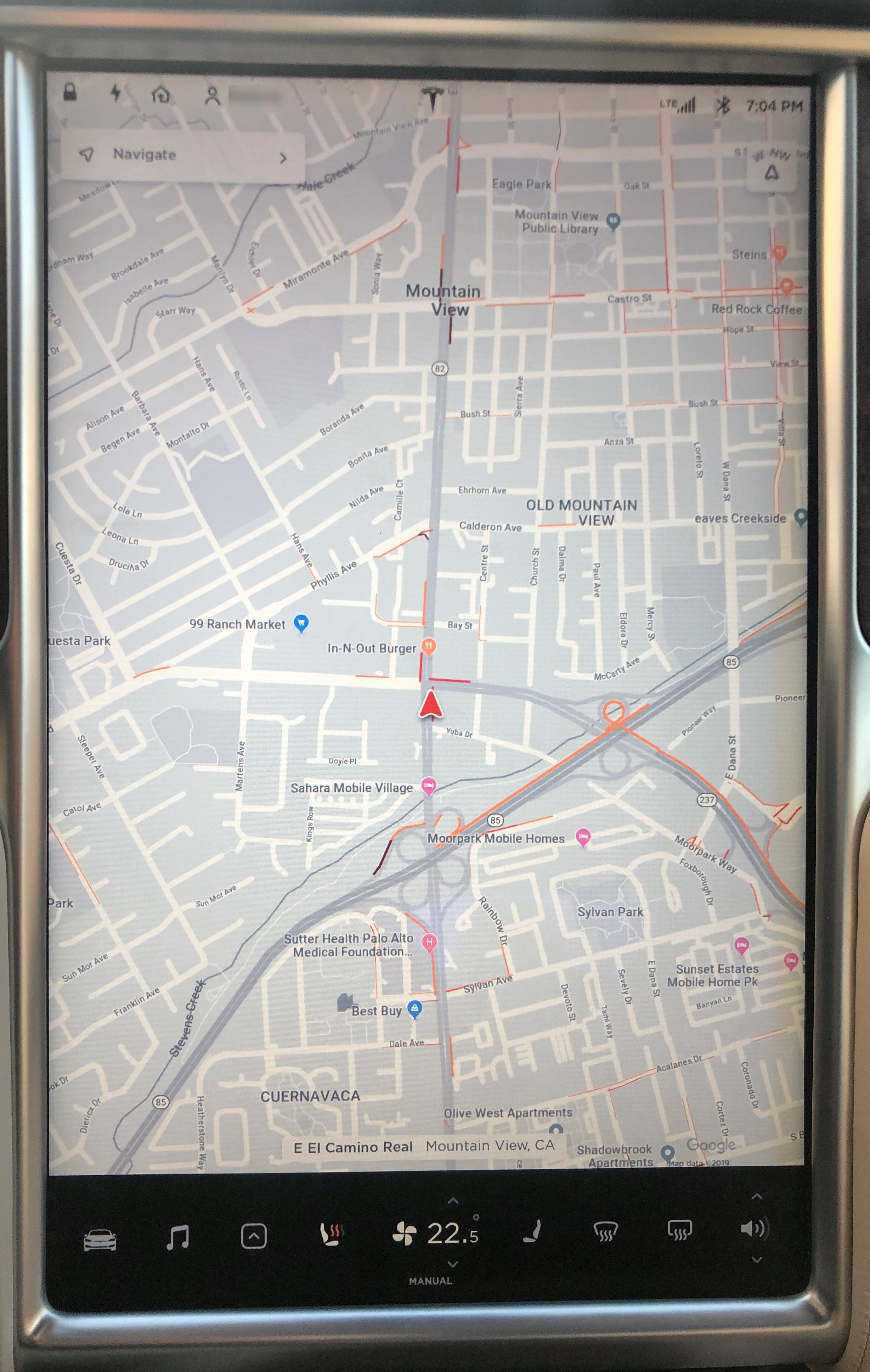
Yet, Tesla’s map app is always displayed in the background of all apps. As a result, the status bar at the very top of the screen can be hard to read, as it blends in with the map text. Moreover, it can be quite irrelevant (and potentially distracting) to a see a brightly colored street appearing between two application windows, like in the screenshot below. Plus, the fact that no application can be brought at the very top of the screen not only takes away user control (and goes against one of the 10 usability heuristics) but is also wasteful, forcing users to see at the top a small part of the map that carries very little information.
The map in the background also makes the interaction with the other apps more error prone: if you’re trying to increase the size of an app window, you will have to drag from the top edge of the app’s view. But if you’re not careful and position your finger above the window handle, nothing will happen — because the OS will assume that you are swiping the map instead of maximizing the map window.


Understanding the Information Displayed Can Be Challenging
If you want to change lanes while driving a Tesla, you can use any of the following sources of information:
- The old-fashioned rear-view mirror plus your side mirrors and turning your head left/right to check lane availability
- The rear-view camera (In previous versions of the Tesla OS, you could pin that at the top of the main touchscreen. Now it’s never at the very top, so, to glance at it, your eyes need to move from the road down to the touchscreen.)
- The lane-assist feature on the secondary screen, that displays a red line when you’ve engaged the turn signal but the lane is not available

The problem is that none of these information sources are complete (for example, the rear-mirror view is partially blocked by headrests), and by the time you check them all, you’ve already reached your destination. So, what most people end up doing is taking a shortcut to save interaction cost and relying on just one of these sources of information. Which one do you think they’re most likely to pick? The one with the lowest interaction cost: the lane assist displayed on the secondary dashboard, which always appears when the turn signal is engaged.
(This is actually an example of successfully unlearning an old, well-rehearsed behavior — app designers who struggle to teach users how to become more efficient should take a lesson from Tesla’s book: if you make it easier than what it was before and you always show it to them at the right time, users will eventually rely on it.)
So, if people end up doing the same task faster, it’s good, right? Well, it would be if this solution was guaranteed to work correctly in all circumstances. In fact, Tesla warns against relying solely on lane assist for lane changes. Even barring sensor errors (which are more common than one would expect), it can be challenging to interpret the displayed information correctly. The problem is that the user may not recognize to what lane the lane-assist cues apply. To understand why, imagine that you are driving on a three-lane road and you want to switch lanes from the rightmost lane to the middle lane. When you engage the turn signal, the car might show that the lane is free. But, as soon as you reach the middle lane, the car will show information about switching into the left lane since your turn signal is still engaged. Yet, users are not always perfectly aware of the location of their car — so as they may check the lane-assist display, engage in a lane switch, then check again the display, notice the red alert (which this time would pertain to switching into the next lane), misinterpret that as referring to their current goal, and panic, swerving the car back into its original lane.
This example points out an important dilemma that car designers and manufacturers face today. New features such as autopilot (or self-driving), lane assist, collision detection and so on have the potential to replace well-learned, traditional driver behaviors such as looking over the shoulder or checking the mirrors that we used to rely on. If these features are functional and using them is are easier than performing the gestures and actions that we learned in driving school, then they will replace those actions (we are creatures of minimum effort: we always take the solution that requires least work — not because we’re lazy, but because we’re efficient). That’s why we hear in the news about people putting on makeup, playing games, or even sleeping at the wheel — because modern cars make it seem safe to do so. Yet, it is our responsibility as designers to create the right mental model and give people the right understanding of how our systems work, in order to make sure that by displacing these old-fashioned behaviors we’re not making driving more dangerous.
The Good
As we noted above, there are many improvements that could be made to Tesla’s UI. But there are also several elements of good design.
- The big screen is a plus: it offers the ability to see multiple application windows side by side. Switching apps can be a pain (as it does involve multiple taps and looking at the screen), but the ability to see several of them (e.g., the rear-view camera and the map or the media player) simultaneously makes things easier for the driver.
Driving is a situation where people do need to access multiple sources of information simultaneously (e.g., the map and the rear-view camera) and seeing all those windows at the same time significantly decreases the user’s working-memory load. (In contrast, even on the biggest tablets, people rarely split the screen to show multiple windows at the same time, although this feature has been around for a while.)
- The map app is enriched with Tesla-specific information. For example, even though the app is based on Google Maps, it does have several options specific to Tesla owners:
- the location of superchargers is automatically displayed on the map
- when navigating to a destination, the map shows how much charge will be left in the battery at the time when the destination is reached
- the navigation app allows users to receive directions based on the use of the car-pool lanes

The map app shows how much charge will be available when the destination is reached. - The autopilot and self-navigation systems acknowledge the possibility of failure and require drivers to keep their hands on the steering wheel while active.
- Tesla is always connected to the internet and can receive updates through the air. This feature can be viewed both as a plus and as a minus. The good is that bugs can be fixed quickly and deployed to cars in the same way in which a website can change colors from one day to the next. Analytic data about the drivers can be easily connected, bugs can be reported, and problems fixed. Unfortunately, a continuously changing interface can also create potentially fatal issues if users’ expectations formed in prior versions are now suddenly violated. (Plus, one must trust that the car manufacturer will only deploy safe, well-tested versions of the operating system.)
Conclusion
Modern cars are powerful computers. They can augment drivers’ cognitive and physical abilities with information collected from a variety of sensors; they can also enhance the driving experience with a plethora of convenience features that are one tap away. Yet none of these will truly happen until car designers take into account the decades of designing computer interfaces and follow well-known principles of usability and human psychology.