
What's new in gnuplot 5.2
| Benefits for LWN subscribers The primary benefit from subscribing to LWN is helping to keep us publishing, but, beyond that, subscribers get immediate access to all site content and access to a number of extra site features. Please sign up today! |
This article is a tour of some of the newest features in the gnuplot plotting utility. Some of these features are already present in the 5.0 release, and some are planned for the next official release, which will be gnuplot 5.2. Highlights in the upcoming release include hypertext labels, more control over axes, a long-awaited ability to add labels to contours, better lighting effects, and more; read on for the details.
Most of the examples in this article should work as-is in the 5.2 alpha release when it is available; they should also work with latest development version, the source for which can be downloaded from the repository and compiled. There is also a new stable branch for 5.2 that was established as this article was written; this may be the best choice for users who want the latest features and don't mind compiling themselves.
For an introduction to gnuplot — what it is, where it comes from, how to compile and install, and how to get started using it — please refer to our earlier article.
Why gnuplot?
Gnuplot is no longer the only open-source graphing system available. During the 30 years of its existence, several other programs and libraries have become popular, including the widely-used Matplotlib library for Python. Those who rely on gnuplot for their graphing needs, including this author, do so for a number of reasons. Its self-contained, language-agnostic nature — and the ability to be used with any programming language through a socket interface — make collaboration easier. Its ability to work intimately with LaTeX makes for good-looking papers. It makes easy tasks easy (plot sin(x): done); and complex tasks manageable. It is infinitely customizable. It can handle a large variety of plot types, and it's fast and stable when dealing with huge data files.
The reason for gnuplot's large repertoire is the responsiveness of its developers to the needs of its users. Gnuplot is developed by a core group of about 30 contributors from around the world. Ethan Merritt, a professor in the Department of Biochemistry of the University of Washington, serves as the unofficial project coordinator. He was kind enough to share some anecdotes that explain the origins of some of gnuplot's special plotting styles, and its wide diversity of applications. It turns out that quite a few plot types were added to gnuplot in response to various bug reports by users. These "bug reports" were actually feature requests in disguise, as the submitters were under the impression that gnuplot should be able to produce the plots they had in mind, but that some bug was preventing it from working.
One interesting example recounted by Merritt comes from the astronomy field. If you are familiar with observational astronomy, you may be aware that star charts sometimes use something called a "horizontal coordinate system" (or the "alt-az system"). This is a kind of polar coordinate system, but violates some of the assumptions that were built in to gnuplot's idea of a polar plot: for example, the radial axis is reversed. Consequently, when a certain user attempted to make such a plot, problems ensued. The resulting "bug report" caused the developers to learn about this type of coordinate system, and now gnuplot can handle it.
Similar stories are behind several of the new plot types slated for the next release. Let's now take a brief tour of some of these useful new features.
Hypertext labels
Gnuplot already had the ability to plot labels, with their positions, sizes, text, and colors taken from the data in a file. A new feature, intended for use on web pages, reveals the label text when the reader hovers over it with the mouse pointer. Gnuplot calls this the "hypertext" label style. It works with SVG files and the HTML canvas element; our example will use the former. SVG coverage is quite good now in browsers, so you should be able to see and interact with the image unless you happen to be using an unusual browser.
The following gnuplot script is an example of how to use the hypertext style:
    set term svg mouse standalone
    set out "file.svg"
    set datafile separator comma
    set xlabel '% eligible entering 1st grade' font ",16"
    set ylabel '% youth literacy' font ",16"
    unset key
    set yr [50:110]
    set xr [10:110]
    set style fill solid 0.5
    plot "< sort -t, -k4 -gr htxt.dat" using 2:3:1:(log($4/100000)) \
       	 with labels hypertext point pt 7 ps var lc rgb "violet", \
   	 "" using 2:3:(log($4/100000)) with points pt 6 lc "red" ps var notitle
The first line instructs gnuplot to include, inline with the XML that makes up the SVG output, some JavaScript code that handles the mouse integration. The rest of it is familiar gnuplot code, with the exception of the hypertext keyword, which creates the hidden labels. The output looks like:
As you hover over the data points, the titles should appear (note that you need to have JavaScript enabled). In addition, a click inside the image frame will toggle tracking of the mouse pointer with a display of the mouse coordinates.
The reason for reverse sorting the data file by its last column, which determines the point size, is to place smaller points on top of larger ones, so that all the labels can be revealed. The file direction syntax can be used to pipe files through any external command (here, the linux sort command), in case there is no convenient built-in gnuplot command that does what we need.
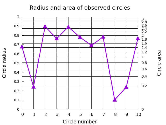
Linked axes
Gnuplot now allows the two y-axes, or the two x-axes, to be related by any mathematical transformation. You do this by using the set link command, which requires you to spell out the inverse transformation as well. We'll align the grid with the y2 axis and plot some random data with this script:
    unset key
    set title "Radius and area of observed circles" font ",16"
    set xlabel "Circle number" font ",14"
    set ylab "Circle radius" font ",14"
    set y2lab "Circle area" font ",14"
    set link y2 via pi*y**2 inverse sqrt(y/pi)
    set samples 11
    set xtic 1
    set ytic .1 nomirror font ",10"
    set y2tic .2 font ",10"
    set xr [0:10]
    set yr [0:1]
    set grid noy y2 x lw 1 lt -1
    plot "+" u 1:(rand(0)) with linespoints lw 3 ps 2 pt 9
The resulting plot looks like:
Parallel-axis plots
Starting with version 5, gnuplot has gained the ability to make an entirely new type of plot. The parallel-axis or parallel coordinate plot is a way to visualize a multidimensional data set that can help in the discovery of patterns and relationships. For example, we'll use a table of physical properties of the elements and these gnuplot commands:
    unset key
    unset colorbox
    set border 0
    unset ytics
    set datafile separator comma
    set paxis 1 range [-1:41]
    set paxis 1 tics 2 tc rgb "#666666"
    set paxis 2 range [-1:100]
    set paxis 2 tics 10 tc rgb "#666666"
    set paxis 3 range [0:5200]
    set paxis 3 tics 0,200,5200 tc rgb "#666666"
    set paxis 4 range [0:5200]
    set paxis 4 tics 0,200,5200 tc rgb "#666666"
    set paxis 5 range [0:500]
    set paxis 5 tics 20  tc rgb "#666666"
    set xtics ("At. #" 1, "At. Wt" 2, "Melt" 3, "Boil" 4, "Therm" 5) nomirror
    set xtics ("At. #" 1, "At. Wt" 2, "Melt" 3, "Boil" 4, "Therm" 5)
    plot "elements" u 3:4:6:7:15:3 every ::1::40 w parallel lc pal lw 2
Running this script on the elements data yields this plot:
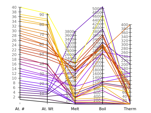
As you can see, it is possible to set the ranges and tics for each axis independently. We've used this flexibility to ensure that the scales for melting and boiling temperature are aligned. Colors for the data lines can be set based on one of the data columns, or on a palette, as we've done here; the colors should be chosen to make the data relationships apparent to the eye.
The plot includes the atomic numbers from 1 to 40; the several gaps are where one of the data columns is missing a value; in that case gnuplot apparently omits the entire line.
Contour labels
One feature that has been missing from gnuplot for the past 30 years, an omission conspicuous to its scientific users in particular, is the ability to attach labels to contours. Many of its devotees, including this author, have devised various hacks to label contours in gnuplot, but now the feature is built-in. Here's an example script:
    set contour
    unset surface
    set view map
    set samp 500
    set iso 100
    set xr[-24:-9]
    set yr [2:4.5]
    unset key
    set cntrlabel start 2 interval 900 font ",11"
    splot lgamma(x)*cos(y)**2 lw 3, lgamma(x)*cos(y)**2 with labels
The cntrlabel setting controls how many labels are put on each contour line, and where on the line they start. Getting the labels on the contours requires two plot commands, one to draw the lines and one to apply the text. The output looks like:

Fancy lighting
Gnuplot has a longstanding ability to color 3D surfaces based on any information that the user chooses, usually the value of the function or data represented by the height of the surface. This can be a great aid to visualization. Simulating the effects of an external light source, modeling the surface as if it were a physical object reflecting light to the viewer's eyes, enhances the 3D perspective illusion, and can help even more in perceiving the shape of complex surfaces.
Gnuplot can now do this. There is a new command to add both diffuse, ambient light and specular highlights, with adjustable intensities. The sample script to show this feature is:
    unset key
    set yr [0:10]
    set xr [0:10]
    set samp 100
    set iso 100
    set view 45,45
    set pm3d lighting primary .5 specular .4
    splot besj0(y)*x**2 with pm3d
And the resulting output is:

This effect is best viewed in interactive mode, though, where the plot can be rotated with the mouse and the lighting effect responds accordingly.
Jitter
Often, data is gathered in a way that causes one or more variables to be "quantized," rather than to be smoothly distributed. For example, some observation may be recorded every hour or day, which would cause the observations to be clustered on the time axis. This will cause the data points to overlap on a scatterplot, for example, which would obscure some of the data. One way to overcome this is to add a small displacement, random or otherwise, to the plotted points, in order to spread them out and make them visible. Gnuplot now has an automated, configurable mechanism for doing just this, using the new jitter command. We'll show how it works using some artificial data. Here is a straightforward scatterplot script:
    unset key
    set xtic format ""
    set ytic format ""
    set grid lt -1
    seed = rand(17)
    plot sample [i = 0 : 99] "+" u (int(i)%10):(int(rand(0)*99)%10)\
    	 pt 6 ps 3 lw 3
It yields this plot:

This just puts some points randomly on a grid. It also happens to demonstrate one use of another new gnuplot command, the sample keyword, which creates a set of equally spaced points within the specified interval.
Jitter can be added to this plot with these commands:
    set jitter spread .2
    seed = rand(17)
    replot
After running the above, we can see that some locations that appeared to be occupied by a single data point were actually hosting more than one:

The spread parameter specifies how much to displace the overlapping points, in coordinate units, and is one of several ways to customize its behavior.
More
There are many more new features and improvements. Here we'll try to summarize a few of the ones that stand out as particularly useful.
Gnuplot has a new data type: arrays. Simply make a declaration like:
array a[20]
to create and initialize an array. Gnuplot arrays can contain
heterogeneous data, so a[1] = 4 and
a[2] = "Graph 1" are possible (the array
index starts at one). Veteran gnuplot
scripters have devised all kinds of hacks for packing data into strings;
this is a welcome addition that will make all that unnecessary.
The sequence of colors that gnuplot uses by default for plot elements has been refined: it is now more useful for people with partial color blindness.
The dot-dash line pattern can be set independently of other line properties, and it can be set visually. For example:
plot f(x) dt "--..-"
There is a new geographic coordinate system, which can convert decimal degrees into tic labels formatted with latitude and longitude expressed as degrees, minutes, and seconds.
Gnuplot now supports an interesting new output device called DomTerm. This is a terminal that supports embedded graphics, allowing the user to interleave commands with gnuplot's output. The experience is somewhat like using the imaxima Emacs interface or Sage notebooks, both of which were described in this article.
The symbol used for plotting with points can be controlled by the value of the data, just as color and size could before.
An experimental feature performs automatic binning of data for histogram or other plots. Up to now this had to be done externally or manually in the script.
Polar plots have been improved, with support for tics and labels around the perimeter, a circular border, the astronomer's horizontal coordinate system (see the Introduction), labeling the radial axis, and assigning the location of θ = 0.
Finally, there are a few new features that make scripting more convenient. For example, you can store data in a named block for reuse, there is a new import command that lets you name a function provided by an external shared object, there are continue and break statements, and you can now pass arguments to gnuplot scripts.
Acknowledgement
Thanks to Ethan Merritt for explaining gnuplot's versioning conventions and sharing information about the development process.
| Index entries for this article | |
|---|---|
| GuestArticles | Phillips, Lee |
(Log in to post comments)
using DomTerm output
Posted May 30, 2017 2:36 UTC (Tue) by Per_Bothner (subscriber, #7375) [Link]
Here is a short blog article on using DomTerm with gnuplot. Feel free to contact me if you have any questions.
What's new in gnuplot 5.2
Posted May 30, 2017 8:21 UTC (Tue) by ehiggs (subscriber, #90713) [Link]
http://www.gnuplot.info/faq/faq.html#x1-120001.7
"""
Gnuplot is neither written nor maintained by the FSF. At one time it was distributed by the FSF but this is no longer true. Gnuplot as a whole is not covered by the GNU General Public License (GPL).
Gnuplot is freeware in the sense that you don’t have to pay for it. However it is not freeware in the sense that you would be allowed to distribute a modified version of your gnuplot freely. Please read and accept the modification and redistribution terms in the Copyright file.
"""
Maybe I'm weird but I keep thinking that people need to be made aware of this.
What's new in gnuplot 5.2
Posted May 30, 2017 9:55 UTC (Tue) by leephillips (subscriber, #100450) [Link]
What's new in gnuplot 5.2
Posted May 30, 2017 17:18 UTC (Tue) by dvrabel (subscriber, #9500) [Link]
Clause 3 of gnuplot's license (provide your name and address as the primary contact for the support of your modified version) makes it non-free according to my reading of the DFSG and the dissident test from the DFSG FAQ[1].
What's new in gnuplot 5.2
Posted May 30, 2017 17:28 UTC (Tue) by leephillips (subscriber, #100450) [Link]
What's new in gnuplot 5.2
Posted May 30, 2017 17:53 UTC (Tue) by Jonno (subscriber, #49613) [Link]
If you look closely, you see that they have repackage the source with a "+dfsg" version suffix. That means that the Debian maintainer had to remove something non-free in order for the the free parts of the package to be included in Debian.
So by your own standards, gnuplot is *not* "free enough", though apparently a useful subset of gnuplot is.
What's new in gnuplot 5.2
Posted May 30, 2017 18:49 UTC (Tue) by leephillips (subscriber, #100450) [Link]
”So by your own standards, gnuplot is *not* "free enough”
That would be denying the antecedent.²
¹https://www.gnu.org/licenses/license-list.en.html
²http://www.fallacyfiles.org/denyante.html
What's new in gnuplot 5.2
Posted May 30, 2017 19:25 UTC (Tue) by k8to (guest, #15413) [Link]
See http://gnuplot.cvs.sourceforge.net/gnuplot/gnuplot/Copyri...
It says quite clearly:
> Permission to modify the software is granted, but not the right to
> distribute the complete modified source code.
That seems to violate the "four freedoms" definition of free software, specifically "Freedom 3", the right to distribute copies of your modified version to others.
A subset of gnuplot is still effectively under the GPL, because it originally was licensed as such, so it's possible that Debian is distributing that subset, or it's possible that the Debian maintainer made a mistake.
What's new in gnuplot 5.2
Posted May 30, 2017 19:29 UTC (Tue) by k8to (guest, #15413) [Link]
> Modifications are to be distributed as patches to the released version.
I suppose this preserves all freedoms, just not with convenience.
What's new in gnuplot 5.2
Posted May 30, 2017 19:46 UTC (Tue) by leephillips (subscriber, #100450) [Link]
I suppose it does, at least in the opinion of the FSF (see my link above). Note also that the FSF used to actually distribute gnuplot.
"A subset of gnuplot is still effectively under the GPL, because it originally was licensed as such"
This doesn't sound likely. The first version of the GPL was disseminated in 1989¹. Gnuplot was publicly released in 1986 (as far as I can tell).
What's new in gnuplot 5.2
Posted May 30, 2017 20:47 UTC (Tue) by k8to (guest, #15413) [Link]
It seems that the GPL components are recent dual-licensed additions (for some values of recent.)
What's new in gnuplot 5.2
Posted May 30, 2017 20:51 UTC (Tue) by k8to (guest, #15413) [Link]
What's new in gnuplot 5.2
Posted May 31, 2017 1:53 UTC (Wed) by pabs (subscriber, #43278) [Link]
What's new in gnuplot 5.2
Posted Jun 1, 2017 2:20 UTC (Thu) by rav (subscriber, #89256) [Link]
What's new in gnuplot 5.2
Posted May 30, 2017 19:51 UTC (Tue) by sfeam (subscriber, #2841) [Link]
I think you are over-interpreting the +dfsg tag. From the DebianMentorsFaq:What does “dfsg” in the version string mean? “+dfsg.N” is a conventional way of extending a version string, when the Debian package's upstream source tarball is actually different from the source released upstream.
There are currently 7 Debian-specific patches in the Alioth git repository for packaging gnuplot. Only two of these affect the actual source code (one removes inclusion of an "Author" tag in generated PDF files, the other changes the default time format for I don't know what reason). The remaining patches tweak the configuration files to play nicely with Debian's build system.
If you have specific licensing concerns that are fixable, please contact me off-line and we can try to address them.
What's new in gnuplot 5.2
Posted May 31, 2017 12:20 UTC (Wed) by dvrabel (subscriber, #9500) [Link]