How and Why Converse Redesigned Their Logo
We speak with Adam Cohn, VP Global Brand Design, about the subtle but significant update
It’s possible you haven’t seen the new Converse logo, but it’s also possible you’ve seen it and not even realized it’s new. That’s because the redesigned mark draws inspiration directly from the brand’s heritage and uses elements that have been in their visual vocabulary for decades. The new identity began rolling out earlier this month on converse.com and in some marketing materials, but will take almost a full year to complete. Simply stated, the new logo replaces the wordmark that has a star in the letter “O” by combining the star chevron (that has been used as an embellishment on many of their sneaker styles) with a refreshed wordmark. The result is an enthusiastic and forward-looking identity that respects its brand heritage.
![]()
The motivation to redesign comes from the company’s new purpose statement, “Converse exists to serve the daring spirit of youth with tools that enable movement(s).” The parenthetical “s” is very intentional here, being used to speak to both physical activity and cultural change. Thus the star chevron fits perfectly as a graphic representation of this mission. “The star chevron has been in use since the ’70s and we wanted to make it a major part of our identity—that part of the brief was clear: Let’s leverage an icon that’s part of our heritage that’s also representative of moving forward. The challenge was getting our name in the mix so we had to develop a new wordmark,” shared Cohn.

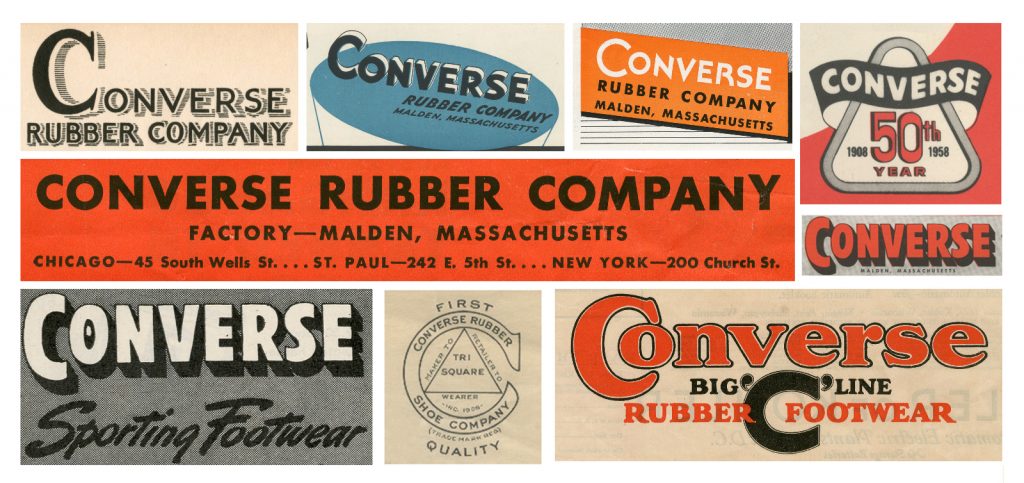
For the wordmark, Cohn and his team reviewed the archive of past Converse logos to find references that played nicely with the star chevron. “The [new] Converse wordmark itself comes from several past identities. The letterforms are a hybrid of four/five versions of the wordmark.” Looking back at past versions we see a heavy influence from the 1920s and ’30s when heavyweight, but approachable sans-serif fonts were used frequently. “The ‘Converse’ word has been written in many different ways as a logo over time; in the end it was about mining details,” Cohn explained.

When asked where in the real world he was excited to see the logo, Cohn answered, “For me, the satisfaction won’t be in one location, but when people think of this logo as our brand over things like the Chuck logo.” Which brings up an important point: the new Converse logo is the company’s brand identity. It is not a new embellishment for their products. “We’re not going to do anything to upset iconic marks like the Chuck Taylor logo,” Cohn explains. That said, we anticipate seeing the logo inside the shoes as the parent, or ingredient branding.
Images courtesy of Converse


