How to Make Venn Diagrams in R
The usually abstract, qualitative and sometimes quantitative chart type shows relationships. You can make them in R, if you must.

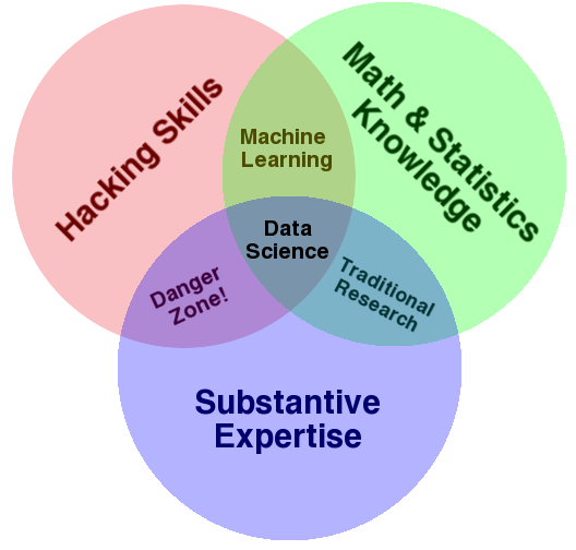
A Venn diagram is typically used to illustrate a concept between two or more categories and their intersection. In this chart genre, you might be familiar with Drew Conway’s data science diagram:
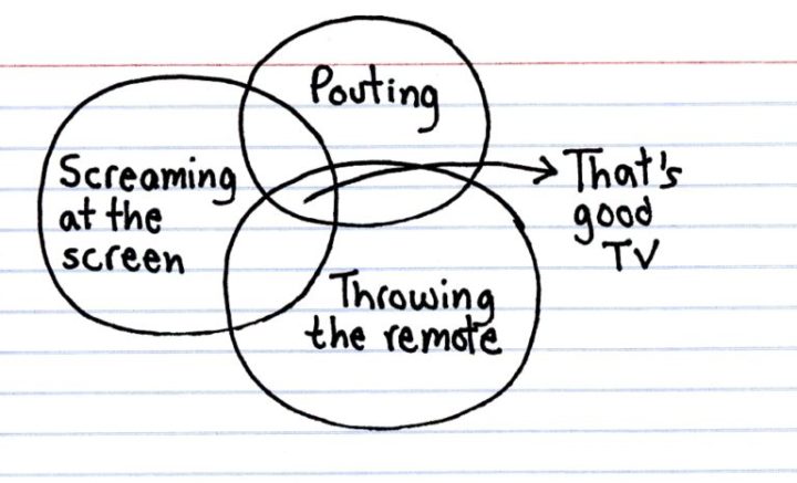
Jessica Hagy uses them often in her index card series:
And there are plenty of other examples. I also wrote a guide for how to read them.
In any case, if you’re reading this, you probably know what a Venn diagram is already, so I won’t get into the background of it.
So, about making these things in R.
To access this full tutorial, you must be a member. (If you are already a member, log in here.)
Get instant access to this tutorial and hundreds more, plus courses, guides, and additional resources.
Membership
You will get unlimited access to step-by-step visualization courses and tutorials for insight and presentation — all while supporting an independent site. Files and data are included so that you can more easily apply what you learn in your own work.
Learn to make great charts that are beautiful and useful.
Members also receive a weekly newsletter, The Process. Keep up-to-date on visualization tools, the rules, and the guidelines and how they all work together in practice.
See samples of everything you gain access to:
About the Author
Nathan Yau is a statistician who works primarily with visualization. He earned his PhD in statistics from UCLA, is the author of two best-selling books — Data Points and Visualize This — and runs FlowingData. Introvert. Likes food. Likes beer.


