When Large Isn’t Large Enough: Designing With Hero Images

Email Newsletter
Weekly tips on front-end & UX.
Trusted by 200,000+ folks.
 Register!
 Flexible CMS. Headless & API 1st


When users come to your page, they’ll feel some kind of reaction. Whether it’s positive or negative, that reaction is determined in large part by what they see. Because vision is perhaps the strongest human sense, a hero image is one of the fastest ways to grab the user’s attention. Bold, graphic and intentional imagery engages the user. It draws the user in immediately and makes a perfect centerpiece for a minimalist app or website.
A hero image is more than just a pretty picture. It’s a powerful communication tool. In this article, I’ll give you a few tips on using hero images. Also, if you’d like to get started and take a go at prototyping and wireframing your own designs a bit more differently, you can download and test Adobe XD for free.
1. Make It Relevant
Think of the hero image like an introduction: It gives users a sense of what to expect from the rest of your website. The whole purpose of a hero image is to tell the visitor immediately what your website is all about and what idea it wants to convey. When a hero image doesn’t accurately contextualize the website’s content, it provides no value to the user. It wastes the precious vertical space of the screen and sometimes can even cause confusion. Visitors are easily confused when an image doesn’t accord with their preconception of the brand or product.

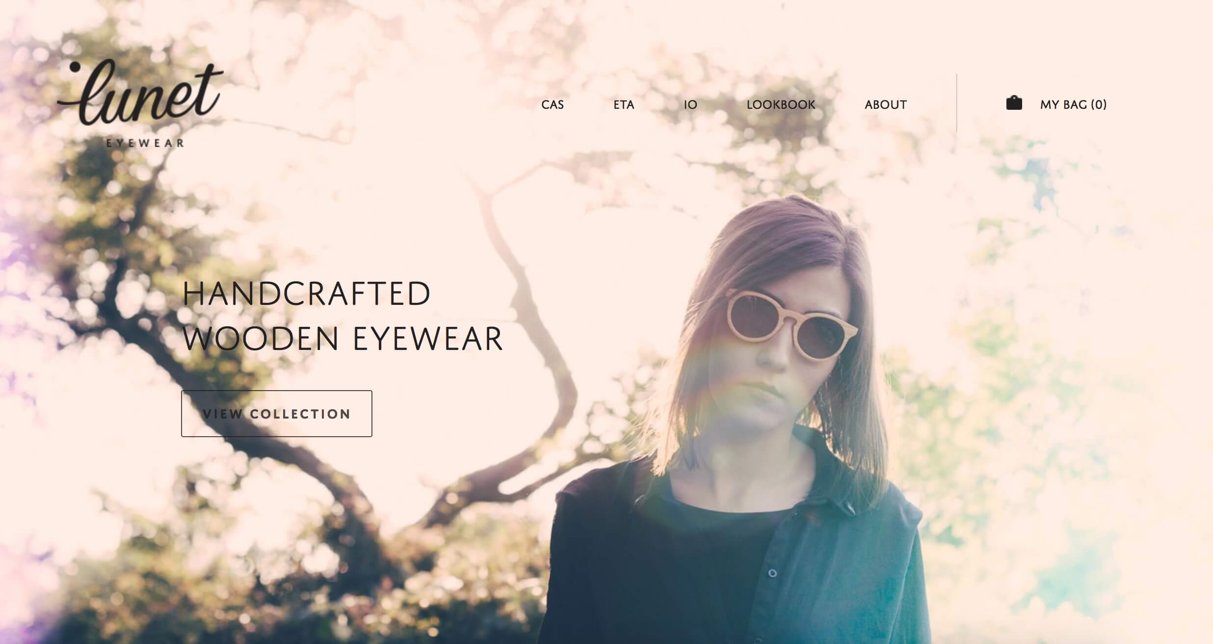
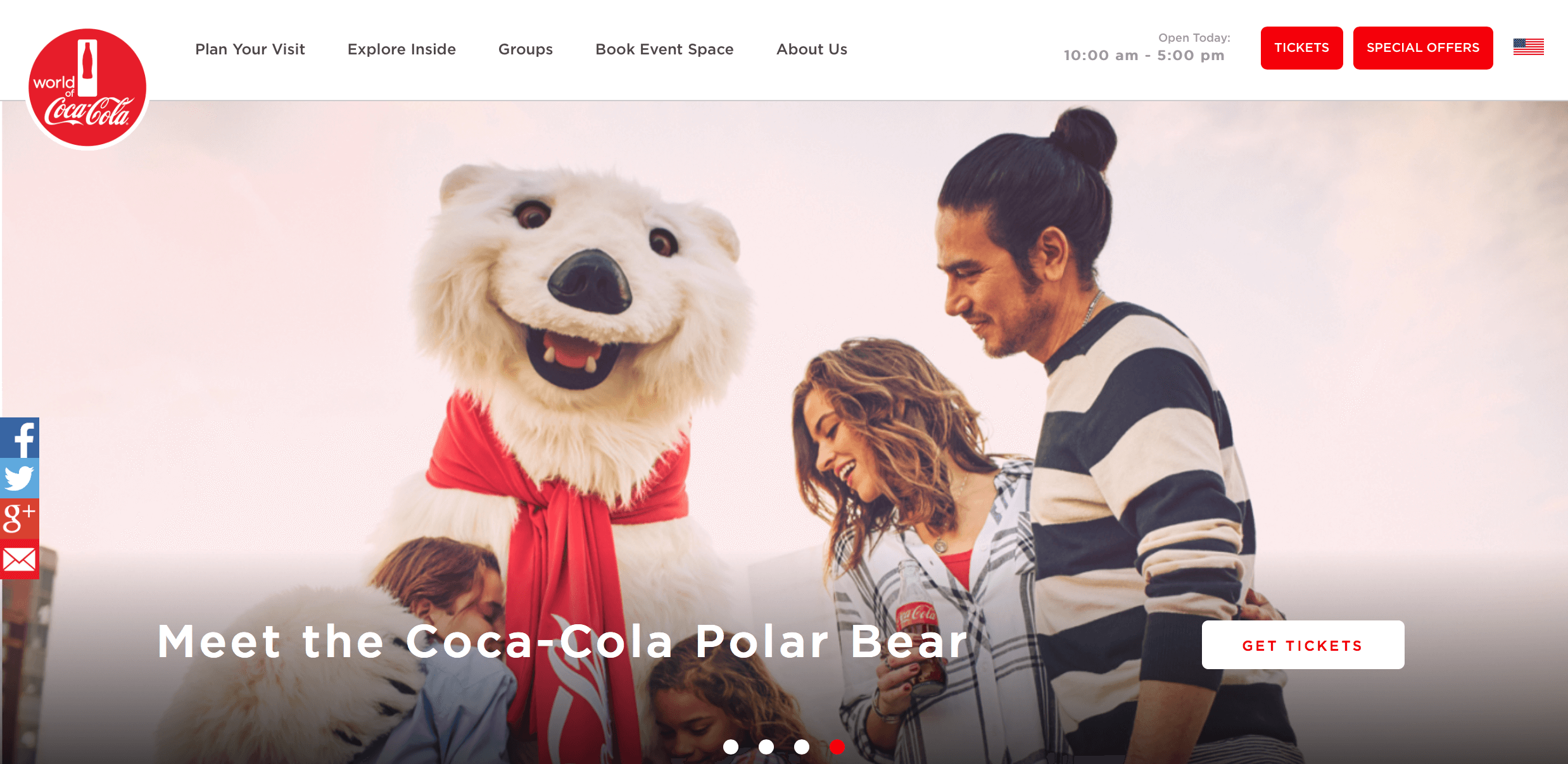
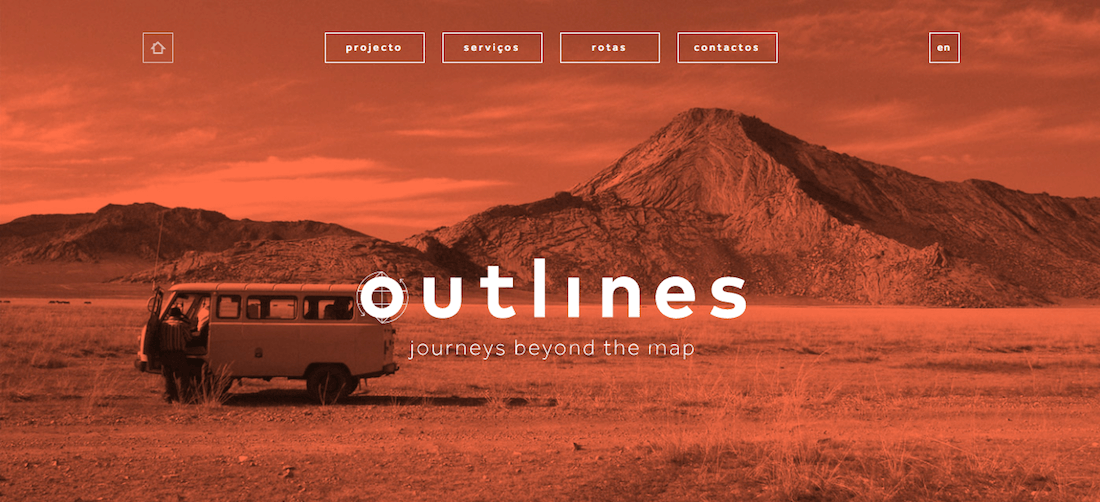
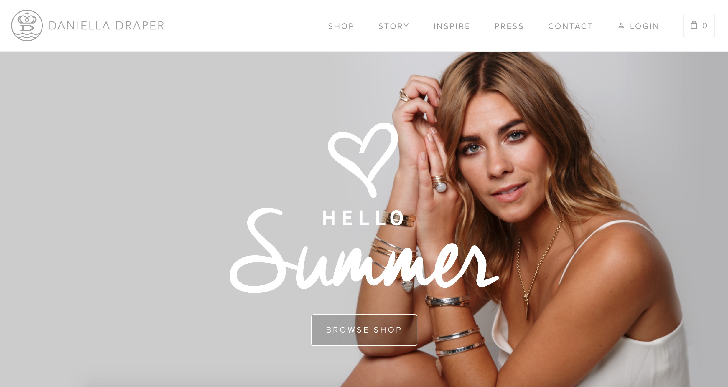
Be picky with the photo. Choose one that fits the theme, purpose or campaign of the experience you’re creating. Check out Lunet Eyewear’s hero image: It clarifies the message of the website. The image’s content is representative of the brand.
If you are using your website to promote or sell a product, the hero image should show off its benefits. Consider using contextual hero images for products — showing not just what a product looks like, but how it works in a real setting.
The same is certainly true of digital products and services. Give people a taste of what they can expect from your app or service by mocking up a screenshot on a compatible device.
Of course, designing and choosing a hero image is difficult; it is as much art as science. To simplify the task, you can use a framework to guide your decisions. Angie Schottmuller created a seven-point framework for judging hero images:
- Keyword relevance
Does the image visualize the targeted keyword? - Clarity of purpose
Does the image clarify the message of the website? - Supportive of design
Does the image support and make more seamless the flow of the page leading to the call to action? - Authenticity
Does the image represent your brand in a credible way? - Added value
Does the image increase relevance or demonstrate benefits? - Desired emotion
Does the image portray emotions that will help to trigger the desired action? - Customer as hero
Does the featured image depict the customer as the hero once they are equipped with the product?
2. Make The Image The Centerpiece
A hero image is the perfect container for one bit of information. You want something that’s distinct and that stands out. It should make the user stop and examine the website each time they visit. But this doesn’t mean that the image needs to say everything. Rather, the image just needs to visually reinforce the message in a relevant way.
3. Select Emotionally Persuasive Images
Emotion should be baked into the design. Your images should have an emotional impact, generate inspiration and reinforce the feeling you are trying to instill. After all, emotion often overrides logic when people are making important decisions. Positive emotional stimuli can build a sense of engagement with your users.
4. Load And Render As Soon As Possible
Because hero images are critical design elements, they should render quickly. Unfortunately, many designs that feature a hero image suffer from HID (hero image delay), mostly due to blocking scripts and style sheets.
Designers need to focus on when a hero image will be viewed. But this is trickier than it sounds: Today’s browsers have no hooks that can be used to know when content becomes viewable. Steve Souders, in his article “Hero Image Custom Metrics,” proposes adding a custom metric to any page that features a hero image to determine how quickly (or slowly) this important content gets displayed.
One simple example is an inline script timer, a script that records the time and that is placed immediately after the img tag. Here’s what the code looks like:
<img src="hero.jpg" onload="performance.mark('hero1')">
<script>performance.mark('hero2')</script>
The code takes advantage of the User Timing API, and you can see how it works on Steve’s test page.
5. Use High-Definition Visuals
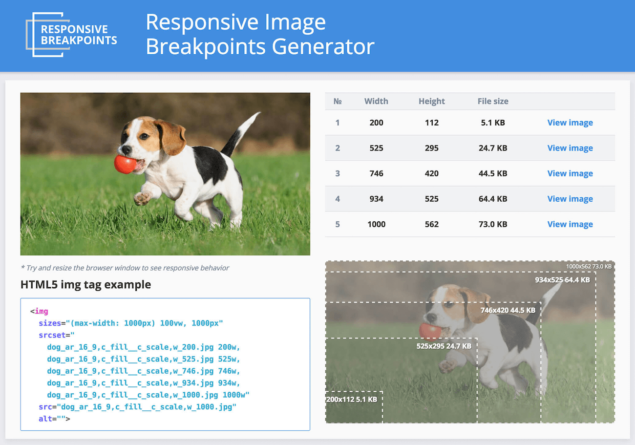
Images should not appear pixelated or blurry. Nothing is worse than a large low-quality image. If you’re going to use this technique, the image is everything, and a positive first impression is vital. Include high-quality images to make sure this happens, however, don’t actively penalize people with low-resolution screens — they are your customers after all as well. For critical images, it’s as critical to provide a variety of image variants using the <picture> element and srcset and sizes — a detailed guide on responsive images has got your back (possible with client hints, too!)

6. Consider Different Screen Sizes
Make sure your images are sized appropriately for displays and across platforms. Optimize images for all devices, even if that means resizing or swapping out a large image for a smaller one on a small device.
Developers of responsive websites, even of the most modern ones, often struggle with selecting image resolutions that best match the various devices. It’s quite clear that one image for all screen resolutions and devices isn’t enough. A website must adapt to look perfect on all of the different devices and in all of the various resolutions, pixel densities and orientations. Managing, manipulating and delivering media — specifically images — is one of the main challenges developers face when building responsive websites. Thankfully, there’s a solution to this problem. Responsive Breakpoints Generator is a free open-source web tool that helps you to generate breakpoints for images interactively.
7. Emphasize The Call To Action
While the hero image is the centerpiece, you will still need to include essential elements, such as a call to action. A call to action shouldn’t compete with the image. Color is very important for emphasis. A call-to-action button should shine even brighter than usual.
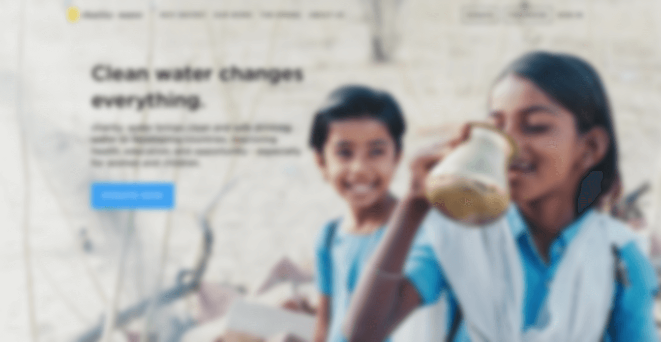
Test Your Call To Action Using A Blur Effect
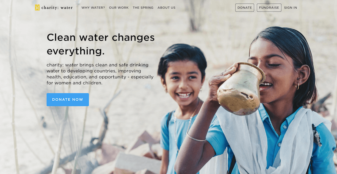
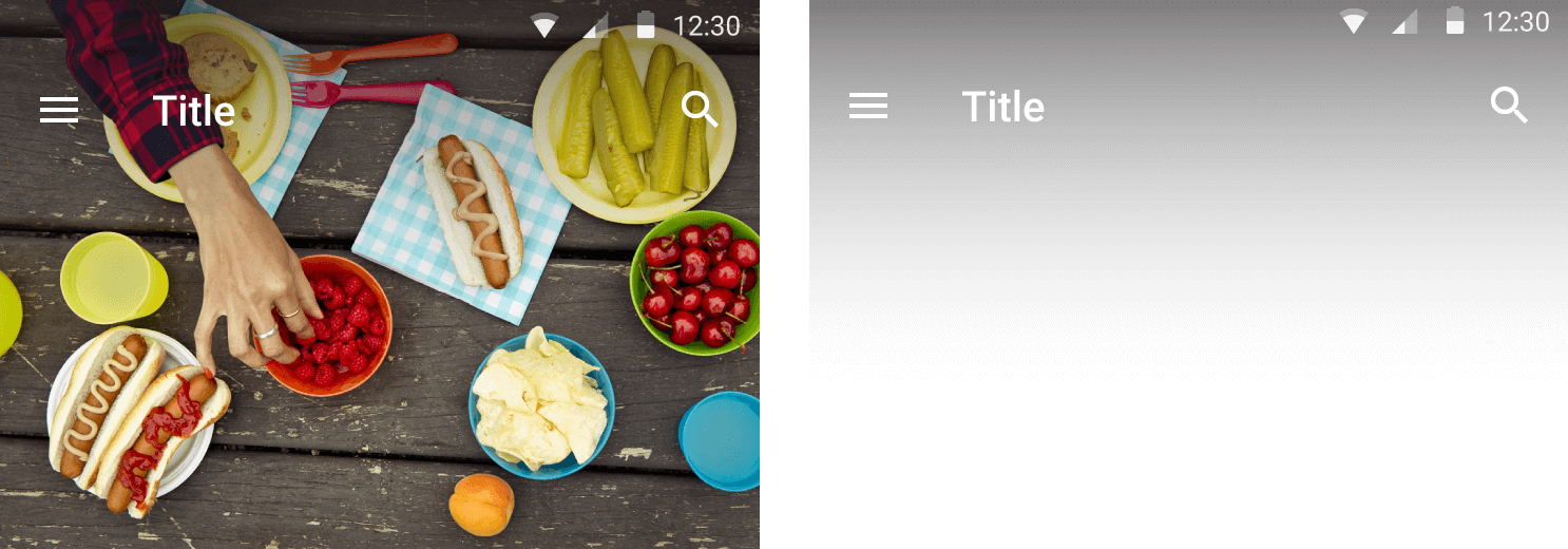
Use a blur effect to test your page’s visual hierarchy. A blur test is a quick technique to help you determine whether the user’s eye will truly go where you want it to go. All you need to do is, take a screenshot of your site and apply object blur effect in Adobe XD (Add blur effects in XD)(see the example of Charity Water’s page below). Looking at the blurred version of your page, which elements stand out? If you don’t like what’s being projecting, go back and revise.
8. Design For Contrast
Make sure the typography on top of the image is legible. Choose bold, easy-to-read typefaces that mesh with the visuals but that stand apart from them. If you plan to lay text over the image, ensure that the main part of the image is still visible and understandable.
Overlay
Perhaps the easiest thing to do would be to put the plain text directly on the image. However, if the contrast between text and image isn’t sufficient, you could overlay the whole image with a semi-transparent colored block.
You can use your brand’s colors to enhance the hero image. If you’re designing for a product or brand, chances are that certain colors will already be associated with it. Identify the primary color and try bringing it to the fore of the image.
Scrims
Alternatively, you could add text contrast in the form of a scrim. A scrim is a visual design aid that softens an image so that overlaid text becomes more legible.
Choose the gradient’s opacity based on the environment. Some hero images call for a darker gradient, such as the image displayed below, which has a 60% gradient.
You’ll find practical advice on how to implement various such techniques in the CSS-Tricks article “Design Considerations: Text on Images.”
9. Show Real People
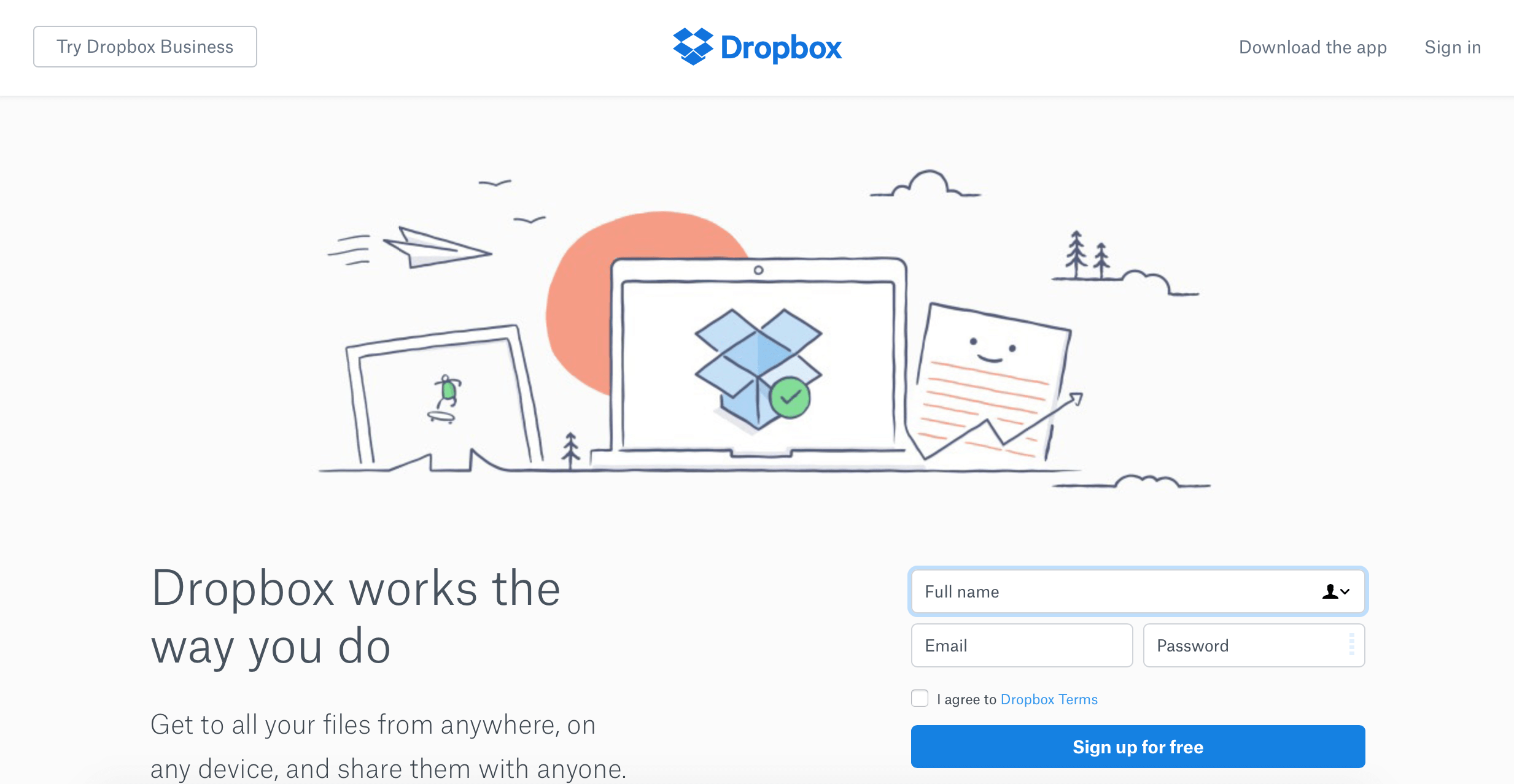
Using images of humans is a very effective way to engage users. When we see people’s faces, we feel connected with them, and we don’t feel like we’re just buying a product. However, many corporate websites are notorious for the overuse of insincere photography, employed to “build trust.”
Usability tests show that purely decorative photos (like the one shown below) rarely add value to a design and harm more often than improve the user experience. Thus, avoid generic-looking business people smiling for no apparent reason.

A very simple rule of thumb is to use high-quality photographs of people who match your app or website’s character. Imagery should be an authentic representation of your product, company or culture.
Here are some tips:
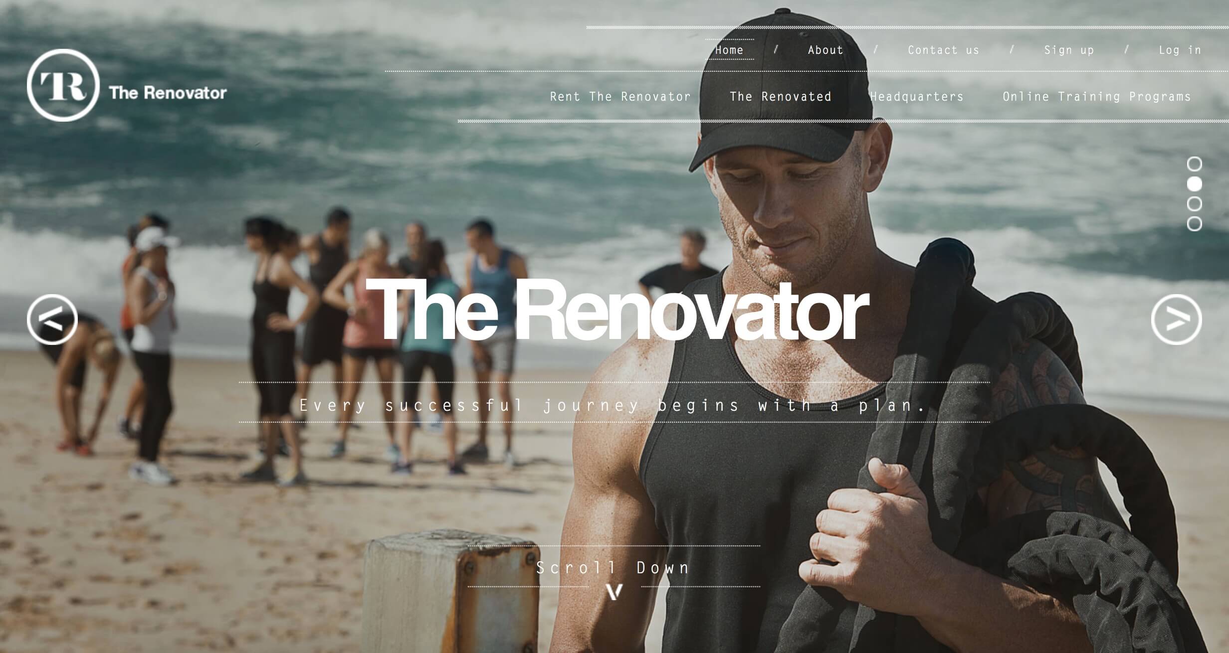
- Try to avoid crowd shots. Use photos that have a single main subject.
- Strive for images that have genuine stories. Take photos of your people doing interesting things. If you have a product, consider ways they can interact with that product.
10. Consider Illustrations, With A Personal Touch
A hero image is merely a visual — any type of image could fit the bill. Illustrations are quickly becoming a popular alternative, sometimes lending more personality than photos. They give you more control over both the image’s content and technical details. Using a unique custom-made illustration, you can distinguish yourself from the crowd and create better brand recall.
To be functional, the illustration should be easily recognizable, and the information it conveys should be decoded similarly by different viewers. If you use multiple illustrations, they should look consistent, like they came from the same source — that is, like they were illustrated by the same person.
Conclusion
As long as it is high quality, interesting to look at and works well with the content, a hero image is a great option. Design with sufficient contrast and a clear call to action to make the most of this technique.
"This article is part of the UX design series sponsored by Adobe. The newly introduced Adobe Experience Design CC (Beta) tool is made for a fast and fluid UX design process, as it lets you go from idea to prototype faster. Design, prototype and share — all in one app. You can check out more inspiring projects created with Adobe XD on Behance, and also visit the Adobe XD blog to stay updated and informed. Adobe XD is being updated with new features frequently, and since it's in public Beta, you can download and test it for free."
Further Reading
- How Functional Animation Helps Improve User Experience
- Not Just Pretty: Building Emotion Into Your Websites
- Choosing A Responsive Image Solution
- How To Design Better Buttons
 (ms, vf, yk, al, il, mrn)

