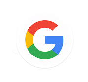
Earlier today, Google unveiled a new logo, the company's first major design change in 16 years. People are going nuts for it. It's flatter than the old logos and more whimsical, but mostly it's just new, which means it looks extremely strange to anyone who's spent more than a decade growing accustomed to the old one.
Here's a slider for easy comparison.
And this is the square, mobile-friendly version.

So far, reactions have been all over the place, ranging from joy to disgust, often from the same person within the span of minutes. Logos are emotional things! Who can say how they will make us feel in any given moment?
@verge bleh.
— Patrick Lucas Austin (@patbits) September 1, 2015 @verge eewwwwwwwwwwww
— trim (@timcameronryan) September 1, 2015 @verge I think I like it :)
— Lars Eisberg (@genanntlars) September 1, 2015 Others found the tilted "e" suspiciously similar to Enron and Mr. Robot's Evil Corp.
just sayin' pic.twitter.com/ExaVCgHCpv
— Charlie Warzel (@cwarzel) September 1, 2015 Or maybe what's really suspicious is how much all of us care?
If Google wanted to unleash its robot army, it could just release a new logo to distract us
— Melanie Ehrenkranz (@MelanieHannah) September 1, 2015 What do you think? Do you care at all? Do you care so much that you need more time to organize your feelings?
Poll
What do you think of Google's new logo?
This poll is closed
- 47%I like it.(4619 votes)
- 18%I don't like it.(1738 votes)
- 20%I'm completely indifferent to it. I feel nothing.(1975 votes)
- 16%I'm feeling so much that it's hard to pin it down as positive or negative. I need more time to process it all.(1576 votes)
:format(webp)/cdn.vox-cdn.com/uploads/chorus_asset/file/15487457/google.0.0.1441123522.jpg)